Scratch Foundation
Redesigning Scratch Foundation’s presence with a brand and website built for clarity, creativity, and global impact.
Overview
Scratch is the world’s leading creative coding platform for kids, empowering over 150 million young people across almost every country. It gives kids block-based tools to learn computing fundamentals and creative problem-solving.
Alongside Scratch’s Scratch Create site (kid-facing, where users build with blocks), there’s the Scratch Foundation site, aimed at donors, families, and educators. The Foundation supports Scratch’s mission through advocacy, fundraising, and resource sharing.
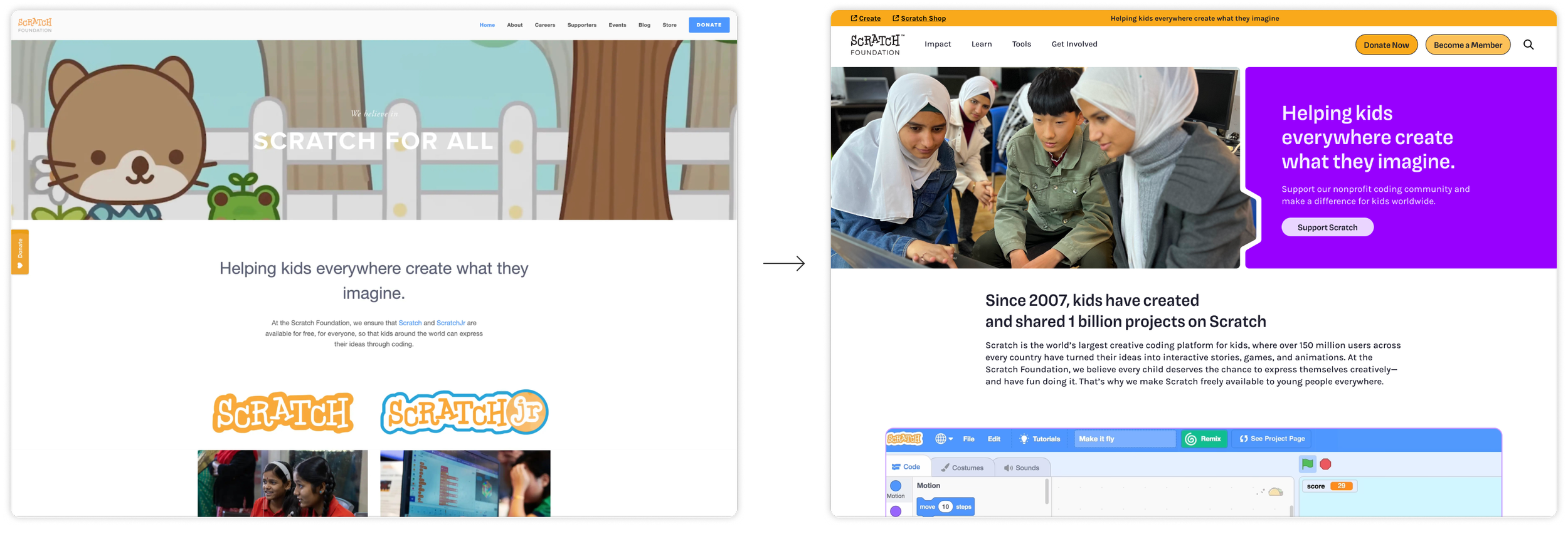
Scratch came to us because their public-facing brand felt outdated; they were launching a membership program for families and needed a site and identity that would better engage adults—communicating stability, warmth, and creative legitimacy.
My Role: I led the entire design process, from brand identity redesign to website information architecture and UX/UI, through to delivery of web templates and launch.
Brand System & Identity
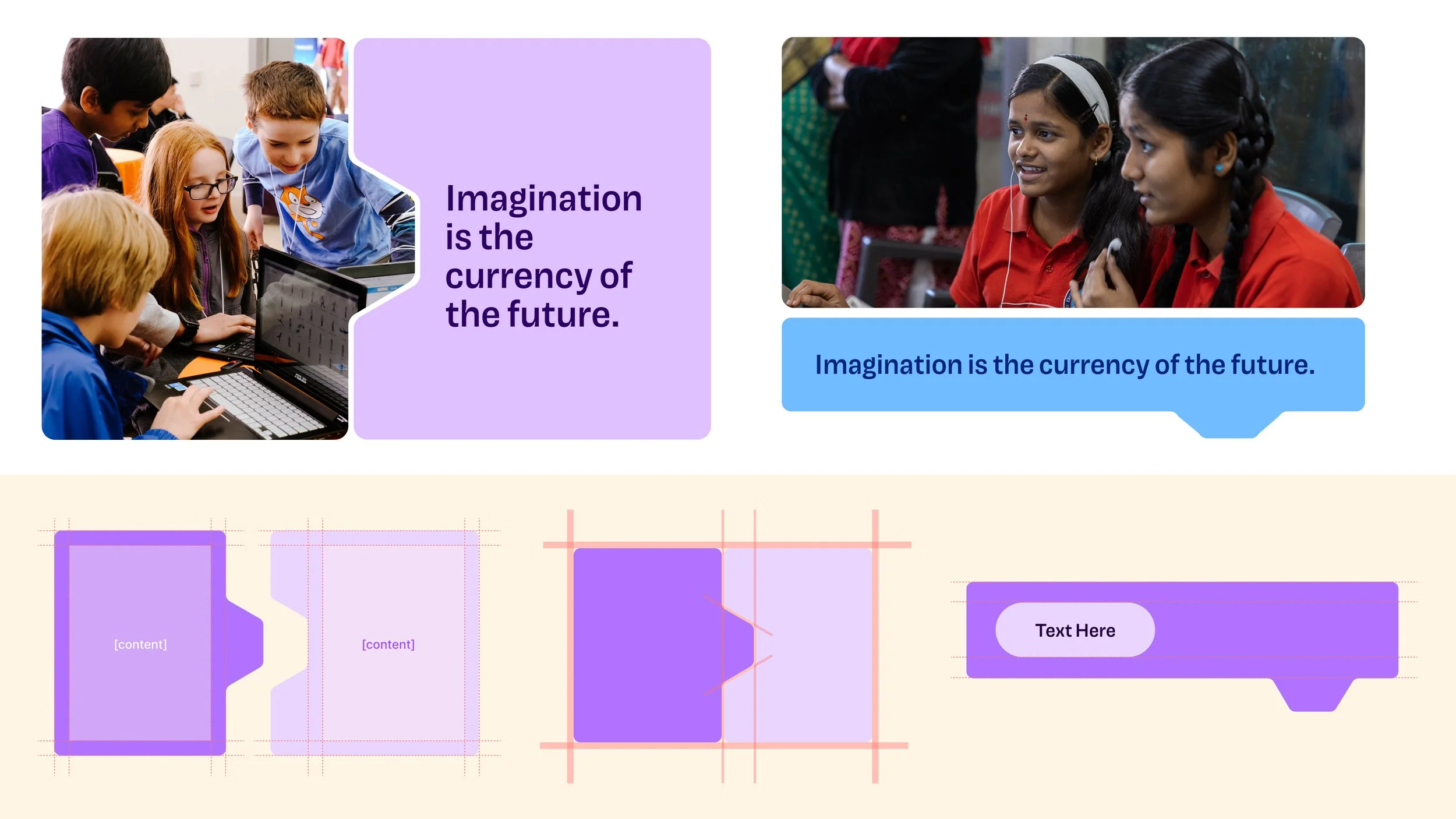
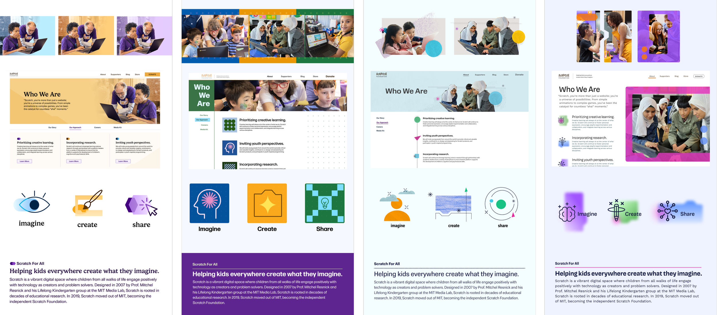
The refreshed identity leans heavily into what makes Scratch instantly recognizable: code blocks that are visual building blocks kids piece together to code. Since Scratch is fundamentally about play, logic, and creativity, anchoring the identity in block forms felt symbolic.
Brand Story
I expanded Scratch’s color palette: richer shades of existing primary colors with deeper tones and subtle contrasts to reinforce creative boldness while preserving recognizability.
Imagery plays a central role: real photos of kids coding in classrooms, with family, during Scratch events, across diverse cultures. Because Scratch is global, I emphasized diversity—in context, geography, setting—to make sure the brand feels inclusive and grounded.
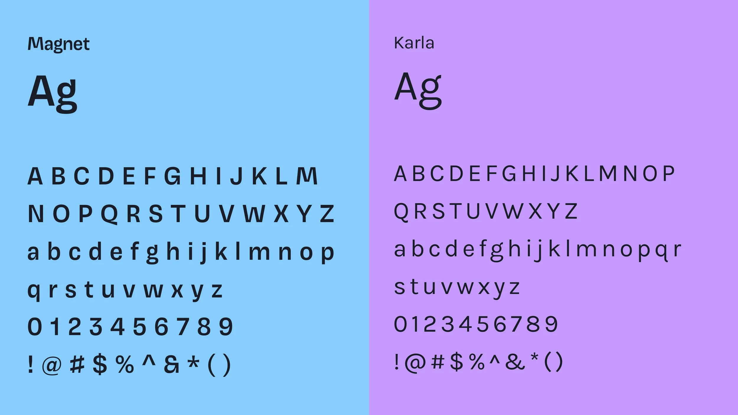
Typography and form were chosen to balance friendliness and clarity: a slightly unconventional sans serif typeface that adds character without sacrificing readability; rounded corners or softened edges echo the shape of code blocks; layout grids draw on modularity to support flexibility.
Together the system reinforces: roots in coding and learning, a strong visual identity adults can trust, and room for play and creativity.

Design Process
To ensure the design felt both authentic and strategic, I facilitated two immersive workshops with the Scratch team:
Workshop 1
We focused on legacy: what aspects of current branding Scratch was proud of, what felt stale, what messages needed updating. We also defined the core audiences—donors, families, educators—and mapped their needs, worries, desires.
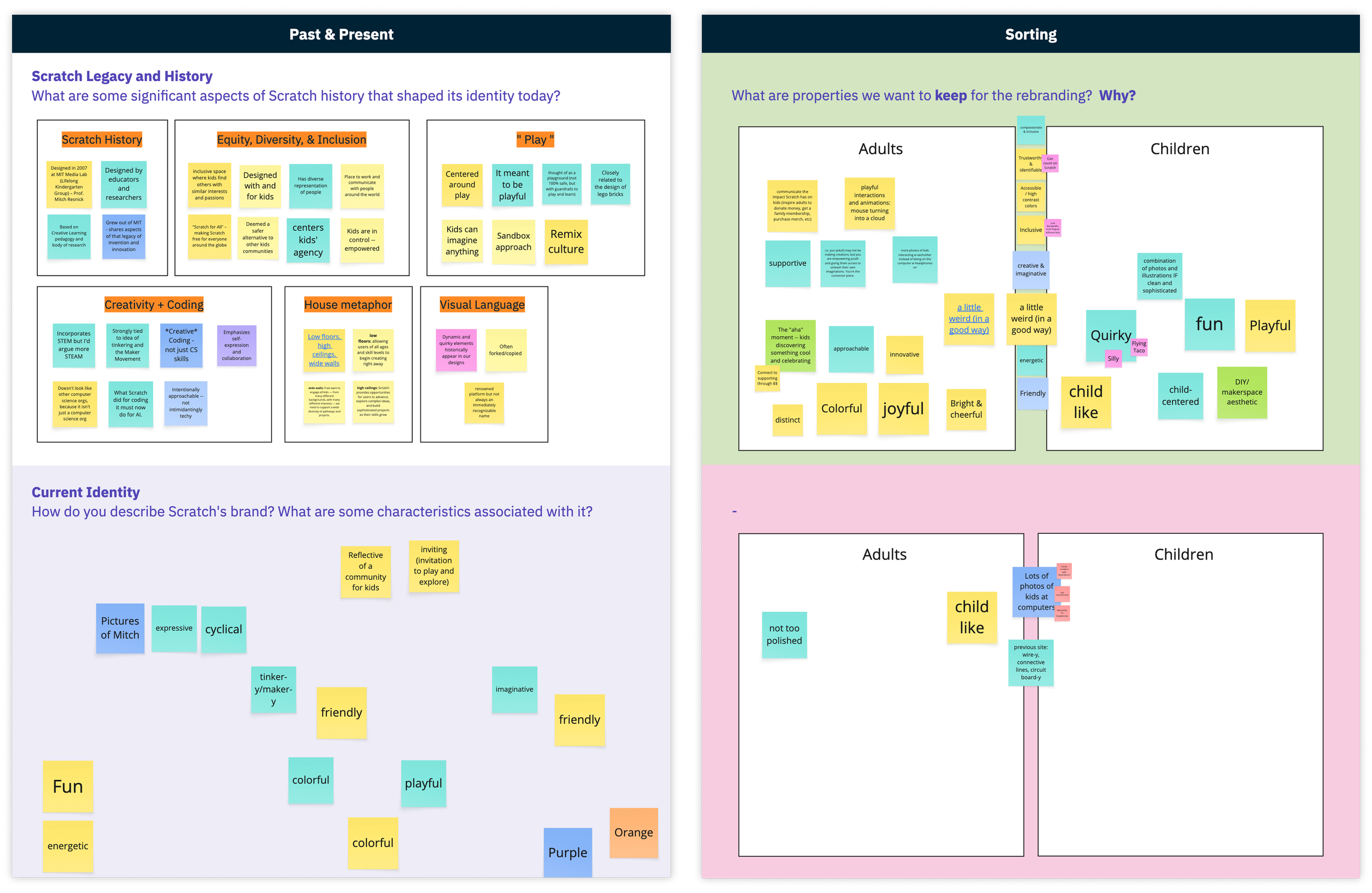
Workshop 2
We started defining personality traits of the refreshed brand; moodboards; collecting visual inspiration; aligning toward a shared vision of what “professional but playful” could look like.
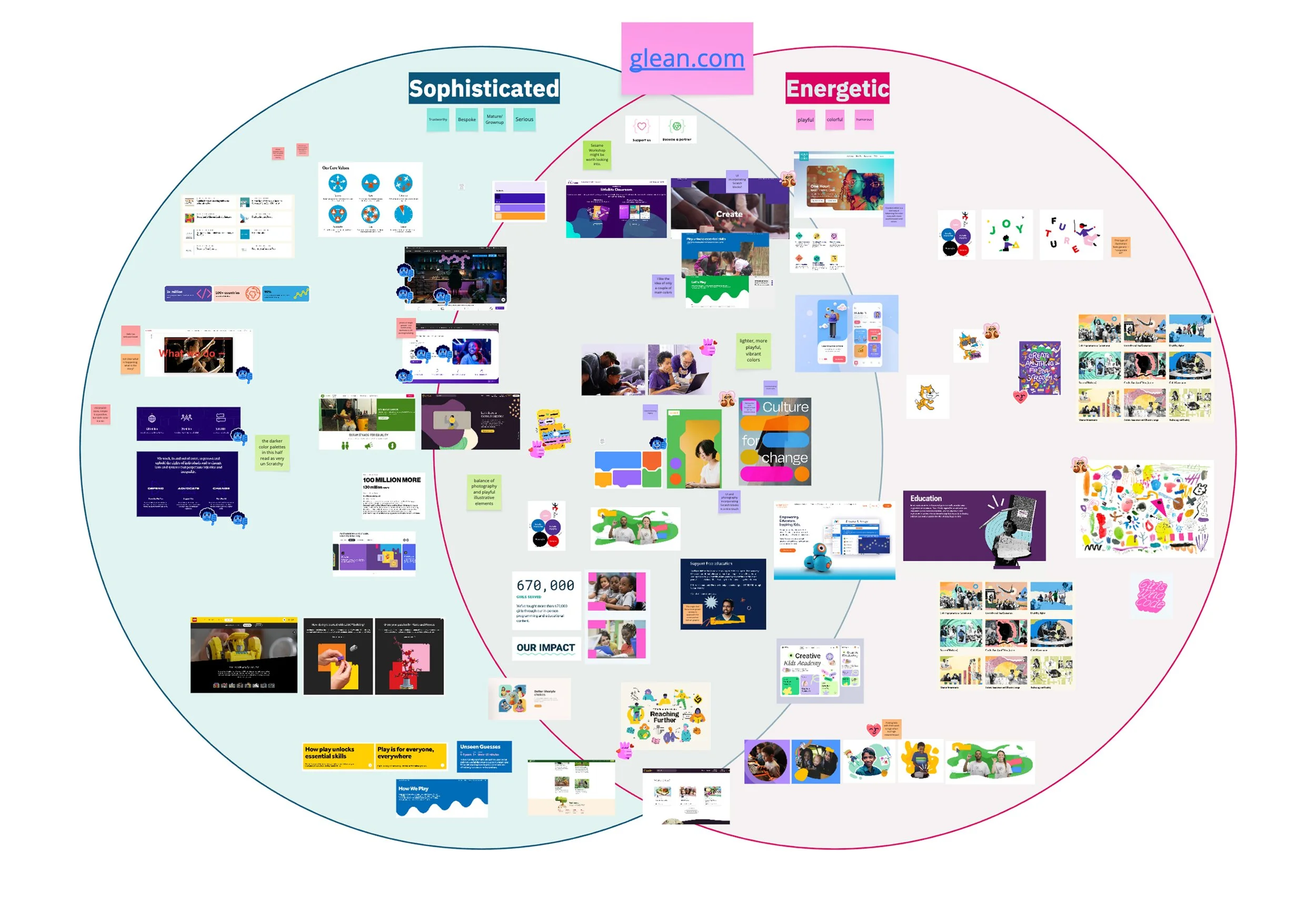
From there I drafted four distinct visual directions. After review sessions with Scratch stakeholders and light user feedback from families/donors, I refined and selected the strongest direction.
Website Redesign & Architecture
The website needed to reflect the new identity and be a practical tool. The goals were clear:
Communicate Scratch’s mission and real impact
Launch and support the new membership program for families
Celebrate donors and make giving feel meaningful
Provide educational resources for families and teachers

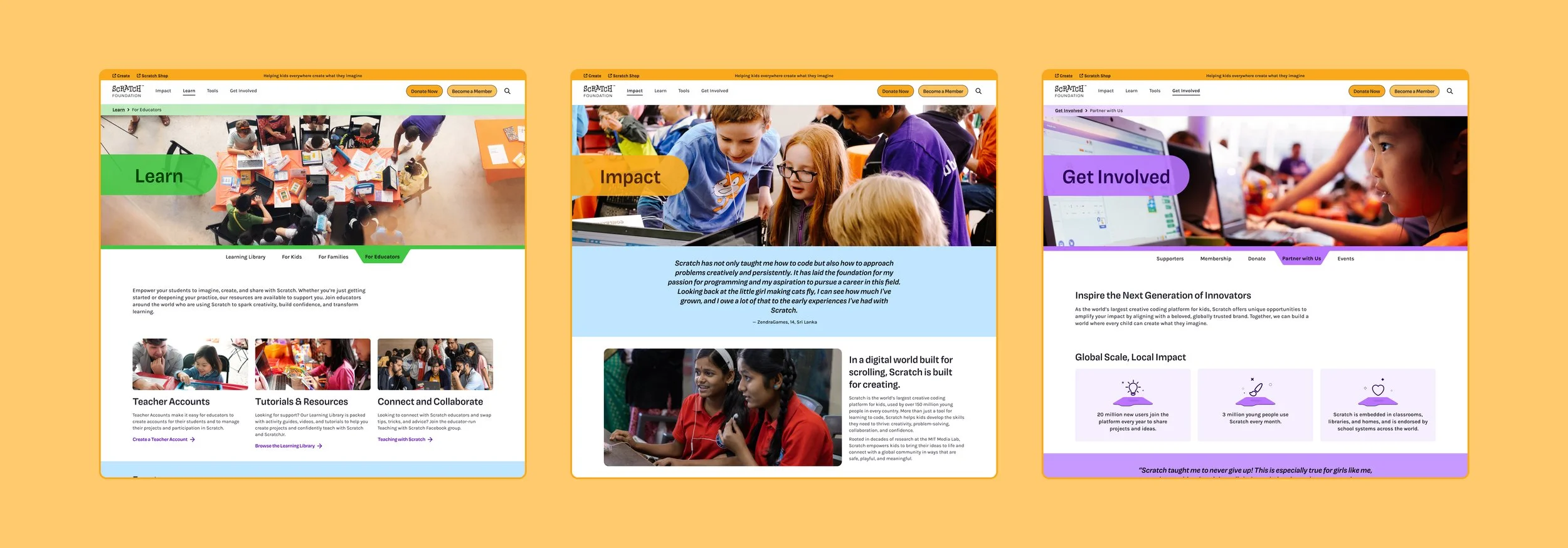
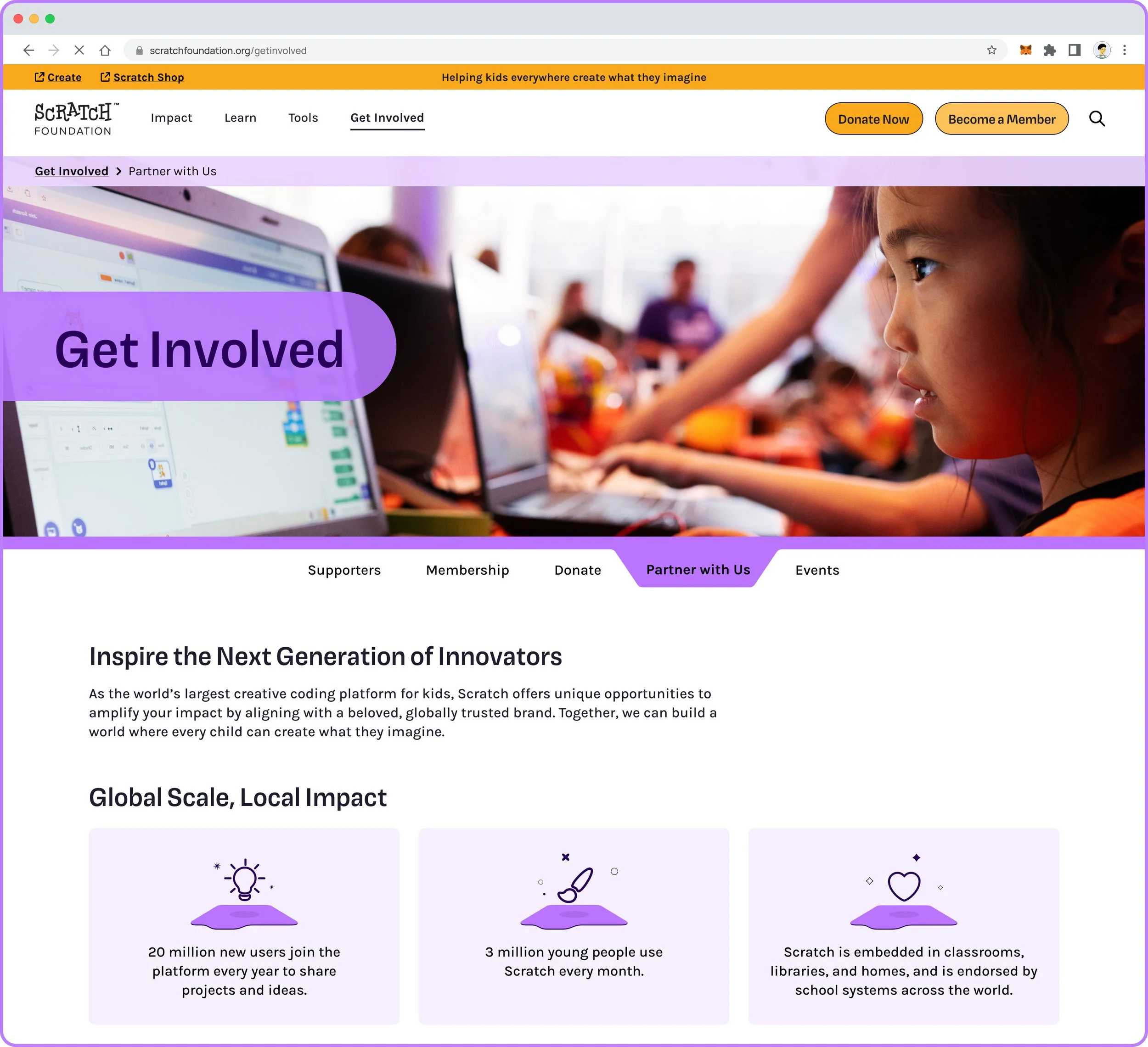
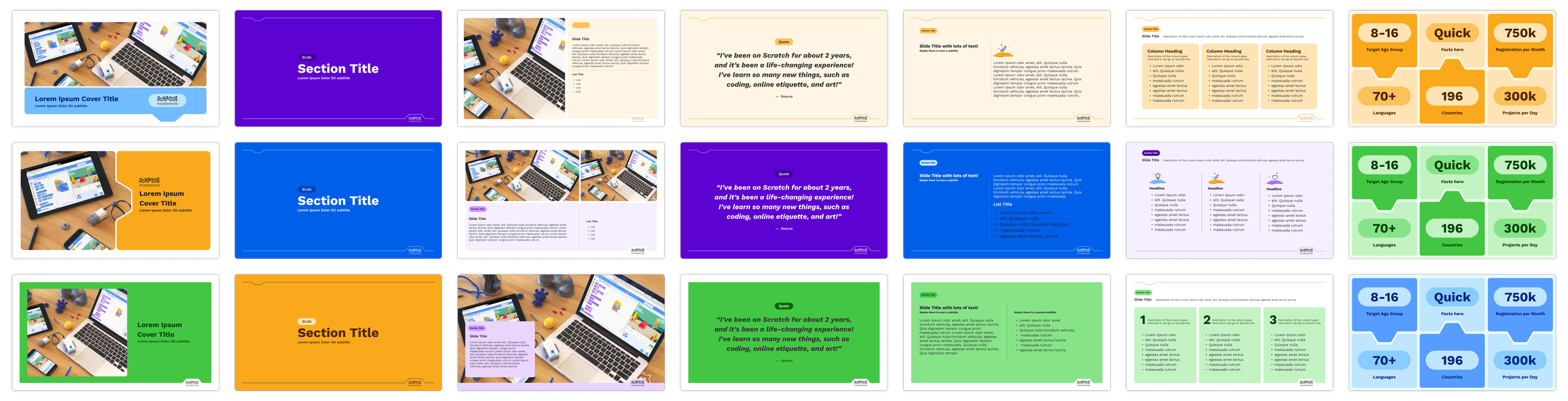
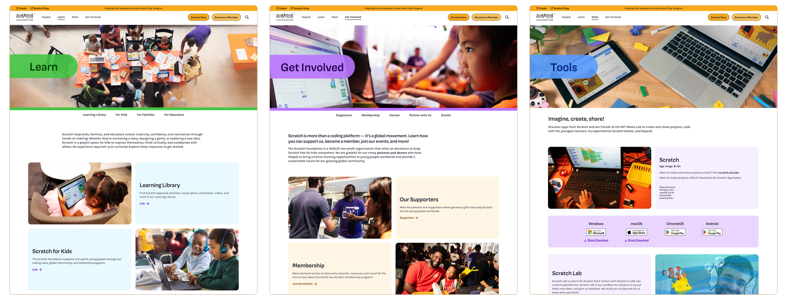
Modular Design
Additionally, content management must be simple for the Scratch team; reuse and modularity to avoid every new page being custom; global audience with varying internet speeds; responsive design across devices.
I worked with the Scratch and tech teams to redesign the site’s information architecture: audited existing content, grouped into intuitive categories, removed outdated or duplicative pages, structured navigation paths so each primary audience (families, donors, educators) could find what they need in two or three clicks.
The front-end was built on a headless CMS, with reusable building blocks (hero banners, resource cards, testimonial layouts, feature grids) so new content can be added without custom dev work. I also ensured components degrade gracefully: images optimized, lazy loading, minimal script overhead, responsive breakpoints across devices and bandwidths.
Outcome
The new Scratch Foundation website launched recently, marking the debut of the refreshed brand system in action. While we’re still gathering post-launch data, early feedback from the Scratch community has been overwhelmingly positive.
The updated identity and modular website system not only strengthened Scratch’s public-facing presence but also gave their internal team the flexibility to manage and grow their platform with ease.